AFP, 2006, 'Sex replaces Bible stories on US radio', ABC Online, viewed 1 August 2006,
<http://www.abc.net.au/news/newsitems/200607/sl700377.htm>
Bear, JH (n.d), Balance. Principles of Design Class 2, viewed 3 August 2006,
<http://desktoppub.about.com/od/designprinciples/l/aa_balance.htm>
Belson, K 2005, 'An MTV host moves to radio, giving voice to audible blogs', New York Times
Bodey, M 2006, 'Disc jockey taken off', The Australian, viewed 4 August 2006,
<http://theaustralian.news.com.au/story/0,20867,20012756-7582,00.html>
Currid, C 1998, 'Pictures help tell the story, with digital camera, e-mail', Houston Chronicle, viewed 2 August 2006,
<http://www.chron.com/content/chronicle/tech/98/08/28/bizcomp.
html>
Lynch, P & Horton, S 2002, Web Style Guide, 2nd edn, viewed 1 August 2006,
<http://www.webstyleguide.com/index.html?/pages/balanced_pages.
html>
Nielsen, J 1997, How Users Read on the Web, viewed 4 August 2006,
<http://www.useit.com/alertbox/9710a.html>
Reep, DC 1997, Technical writing: Principles, strategies and readings, 3rd edn, Allyn and Bacon, Boston, pp 90-128
Safe, G 2006, 'Myspace kills off magazine', The Australian, viewed 4 August 2006,
<http://www.theaustralian.news.com.au/story/0,20867,20006686-7582,00.html>
Wheildon, C 1990, Communicating or just making pretty shapes, 3rd edn, Newspaper bureau of Australia LTD, North Sydney, excerpts pp 4-8 and 11-15
Williams, R (n.d), Web Design Features, viewed 3 August 2006
<http://www.ratz.com/features.html>
Wednesday, August 09, 2006
Tuesday, August 08, 2006
Reflection
This makes the end of my assignment. It is such a relief to actually finish it on time. I have been introduced to the world of blogging few years back but I never knew that blogging for this assignment would be so difficult.
My regular blog is so much easier as it is based on my feelings on a thing and my daily happenings. As for this blog assignment, everything revolves around critiques and reviews.
I have acquired several skills from this assignment. One would be how to search for reliable sources for references. Second would be responsible for what I have said here on this blog. This is because I too have taken words from others for references. As they are also responsible for their work, I too have to do the same. Thirdly would be about design principles. I do not know that to design a web page, the designer have to take so many things into considerations. I would have just design it as I wish and place it where ever I want. But I am so wrong. Designing a web page takes into account a number of things.
I personally have made my stand as a blogger in the critiques/responses. I not only make my stand, I also have to further explain why. I also have to think about the layout of the blog and not only reading it because I am interested to read the blog.
This assignment is an interesting assignment. It may be difficult but the journey was worth it.
Monday, August 07, 2006
How is the consistency?
Reep, D C (1997) also made a point about being consistent throughout a document for three (3) elements.
- Margins
- Typeface
- Indentations
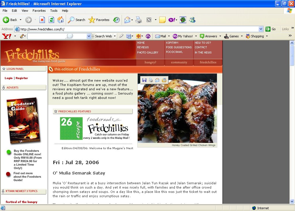
Friedchillies is 100% consistent throughout the entire page.
The headings and sub-headings are easily differentiated and identified. The links are of the same colour. Each entry has its own pictures at the bottom. It also has the same margins and typeface.
The page is not boring as some might seem bored because of its consistency. By being consistent, Friedchillies guided its readers where they want to go easily. It keeps the readers want more. I personally cannot move from the page until I went through almost everything available for me to click on.
Sunday, August 06, 2006
What about sequence?
In Reep, D C (1997), she said that sequence refers to the order of arrangement of the design features for readers to see in the best order when looking at the page. Having readers read from top left corner and end at the bottom right corner.
Main navigation links are at the top of the page as you view the page. The main feature here is of course the entry (review of the food/restaurant) which takes up the most space in the center. The archives are on the left.
As you open the page, the first thing you see is the main navigations which help when you are not sure what to click on. Move to the center where the content really attracts the reader to read on. Once done, move to the left and click on the archives for more!
Saturday, August 05, 2006
Is there proportion?
Friedchillies has proportion in their page. In one glance, you can see the different parts in the page. The navigations are on top, the archives on the left and the entries in the center. The entries are also separated by the size of the typeface use for the date and the title of the entry.
As stated in Reep, D C (1997), boldface is used to give emphasis to
As stated in Reep, D C (1997), boldface is used to give emphasis to
- Headings
- Specific words
- Significant topics
 As you can see from the picture, Friedchillies achieved all of the above. The headings being the date and the sub-heading which is the title is different from one another. Since the review is once every fortnight, the date tells us that there is something new and the title tells us what is that something new.
According to Nielsen, J (1997) , people do not read the web word for word as they scan the pages. There are several ideas to a scannable text and Friedchillies has more than one (1) of it. Friedchillies has meaningful sub-headings which is the title of the restaurant. It also has one (1) idea per paragraph or in this case one (1) idea per entry.
Graphic aids. In Reep, D C (1997), graphic aids are to do the following
- provide quick access to complicated information
- isolate the main topics in complex data
- helps readers see relationship among several sets of data
- offer expert readers quick access to complicated data that would take pages to explain.
 Friedchillies has the best graphic aids (as in picture above). In every entry, the pictures of the food are at the bottom of the page. It does not distract you from reading the entry half way. It also allows the reader to imagine how the food is like before actually looking at the pictures.
Friday, August 04, 2006
Did Friedchillies achieved balance?
According to Bear, J H (n.d) , there are three (3) types of balance which is symmetrical, asymmetrical and radical.
In Friedchillies, I find that the page has an asymmetrical design. As you can see from the picture above, the page has a black space on the right. At one glance, the space is a little distracting.
Reep, D C (1997) stated points on visual "weight" that we must remember
- Big weighs more than small
- Dark weighs more than light
- Color weighs more than black and white
- Unusual shapes weigh more than simple circles or squares
Besides the dark space on the right, the other part of the page is great. The navigations on how to contact the author, gallery and the discussion board are all situated at the top of the page with red background.
The left side of the page is dedicated to their recent postings and also the archives in red and white background.
The center is the review. The review is not full unless you click the word "More" at the bottom of the review entry. When clicked, the full review is shown and there will be pictures at the bottom. The pictures are of the same size and in order thus it did not create any imbalance to the entry.
Thursday, August 03, 2006
The chosen one

Friedchillies.com 'The Malaysian Food Guide' is for all food lovers out there. If you visit Malaysia, you can never run away from the vast variety of food available at every corner, every street and at every state. Friedchillies reviews on the food and hot spots and also has an active forum with varied discussions.
If you do not know where to find the best 'Char Kuey Teow' or if you want to know what is good at Restoran Jaring just click on Friedchillies.
What is a blog?
According to Webopedia, the word blog is short for weblog A blog is a web page that serves as a publicly accessible journal for an invidual. Typically updated daily, blogs often reflect the personality of the author.
When we browse the internet, we can find many types of blog. The main one is personal blogs where the authors talked about their daily happenings. There are also blogs on food, travel, music, and almost everything under the sun.
Below are a few local Malaysian weblogs that are not personal journals.
- ABCMalaysia - travel guide of Malaysia
- Malaysia Best - food, sights, travels and recipes
- Project Petaling Street - a Malaysian blog portal
- Situs Digital Fhoto Jeritan Jiwa - contributions from photographers based on monthly theme
Wednesday, August 02, 2006
Week 3 article
"Disc jockey taken off air" (dated 4 August 2006) is the article I am going to work on for Week 3. Click on the title of the article for the full story, or the following link http://theaustralian.news.com.au/story/0,20867,20012756-7582,00.html
Is it better to let everyone know of your thoughts or should you just keep it to yourself?
The following will be my three (3) issues/responses relating to the article.
1. "Where is your professionalism?"
Being you is easy but to be a professional is not as easy as it seems. One has to learn how not to mix personal feelings and views when at work. Things that are especially said on air cannot be taken back. Now it is not easy to work on air. Everyone takes note of what is said. You have to be sure never to insult or give negative remarks to your listeners. You can ask questions but you are never to give your own comments. Thus, to me, the art of making it big in the media industry, rule of thumb is to maintain professionalism as everything will be taken into attention.
2. "If you have feelings, so does the person you are commenting about"
Everyone has feelings, even animals. You feel hurt when others comment about you bluntly, so does the person you comment bluntly about. In addition to that, you did it on air. The whole world knows of it and also your friends. If you ever want to comment a person, do it in front of them and put them in nice way so that they do not feel offended and hurt. For example, if you want to say to your friend that she has gained weight over the holidays, you can put in by saying, "Mandy, I think you have put on a little weight over the holidays. Want to go for a diet together?" Here, she not only gets to know what you think of her, she also gets your moral support. Even if you do not like a particular person, never spread ugly rumours to everyone. It is really bad.
3. "Hey, respect one another's privacy!"
Respecting another person's privacy is highly appreciated. You never visit a person at their home announced, so you should not invade people's privacy. Everyone has their own life. At home is where they will be able to be themselves - without makeup, in shorts, or even wake up in the afternoon. You definitely would not want everyone to know what is happening in your everyday life. I am sure you exposed only a limited amount of information to your friends. This is because you know that you life will belong to everyone once it is made public.
In the cycle of life, it is said that we are to do to others what we want others to do to us. A simple phrase that everyone understands. And beware, say the wrong thing to the media, and you are going to be in a bad situation.
Reading 11
Reading 11 is the other reading I am to review and also critique or give response to it. It is also taken from my University CD reader. The following is the reference where you could use to find the full story.
-----------------------------
Benson, K, 2005, 'An MTV host moves to radio, giving voice to audible blogs', New York Times
-----------------------------
1. The Summary
Podcasts are digital audio filers that users upload to the Internet for others to download. It can also be homemade radio shows that are formatted for digital audio players.
Adam Curry, a former MTV host and the brain behind the software that allows people to automatically receive these programs either on Apple iPod or any other players will produce and host a four-hour program every weekday from May 13 on Sirius Satellite Radio. He came out with this idea because podcasts are fully unedited and there is no disc jockey to help putting it up for the others to listen from many who make music.
Podcasts are handy. You can play, pause or rewind them whenever you want. With this, users carry their podcast shows with them and they are able to play them anytime. They no longer need to be tuned to a frequency.
2. The Critique/Response
Podcast is the latest technology created. It can be placed in weblogs or websites. Take for instance, a friend of yours did a radio interview at the local station. You missed the interview. But because she uploaded a podcast file of the interview in her blog, you get to listen to it. Thanks to podcast, newly formed bands who want comments from other people besides their own friends will be able to get honest comments from everyone. It is useful that one can even start a talk show based at his own bedroom!
-----------------------------
Benson, K, 2005, 'An MTV host moves to radio, giving voice to audible blogs', New York Times
-----------------------------
1. The Summary
Podcasts are digital audio filers that users upload to the Internet for others to download. It can also be homemade radio shows that are formatted for digital audio players.
Adam Curry, a former MTV host and the brain behind the software that allows people to automatically receive these programs either on Apple iPod or any other players will produce and host a four-hour program every weekday from May 13 on Sirius Satellite Radio. He came out with this idea because podcasts are fully unedited and there is no disc jockey to help putting it up for the others to listen from many who make music.
Podcasts are handy. You can play, pause or rewind them whenever you want. With this, users carry their podcast shows with them and they are able to play them anytime. They no longer need to be tuned to a frequency.
2. The Critique/Response
Podcast is the latest technology created. It can be placed in weblogs or websites. Take for instance, a friend of yours did a radio interview at the local station. You missed the interview. But because she uploaded a podcast file of the interview in her blog, you get to listen to it. Thanks to podcast, newly formed bands who want comments from other people besides their own friends will be able to get honest comments from everyone. It is useful that one can even start a talk show based at his own bedroom!
Tuesday, August 01, 2006
Week 2 article
"Myspace kills off magazine" (dated 4 August 2006) is my chosen article for Week 2. Click on the title for the full story. For direct link, please click http://www.theaustralian.news.com.au/story/0,20867,20006686-7582,00.html
Which is better - Online or print?
Below are my three (3) issues/responses to the article.
1. "Online vs Print"
Which is better - the one that needs to be clicked or the one that needs to be flipped? There are pros and cons for both versions of online and print magazines. Online versions are available in a click of the mouse. It is only available to you on the computer at places that have internet connection or WiFi connection. It may also work for those of you sitting at the office trying to relax your mind of the pile of work right in front of you. Good cover up if your boss is going to make his rounds. Just close the window and it will be gone! Bad thing is, no electricity equals no reading it online. As for the printed version of the magazine, you just have to make your way to the nearest news stand or bookstores. You can read it anywhere and anytime! Blackouts are definitely not a problem for you. The bad thing is that you only can read it during your leisure time or while in the bus or even the rest room. No reading in the office during working hours.
2. "I am living in a generation of technology!"
Yes, in this generation, almost everyone is tech-savvy. Technology seems to be the only language the younger generation knows. You may not have all the technology available in the market but I am sure you would have at least a mobile phone or a desktop. Try saying, "I do not need technology to survive." You are for sure to regret and suffer later. I admit with the growing inventions, life is getting easier, not as complicated and hard like what our fore fathers have to go through. We just have to switch things on, click or press a button and there it is everything that you want. I cannot fully live with all the technology. My brain is turning lazy as I do not even have to think much. My penmanship is getting horrible because I am so used to typing. I got to get myself out of the chair in front of the computer once in a while.
3. "But the contents are the same!"
Contents on the online version and print version have to be the same. It is just for the convenient of others. It would benefit the company if they do not put up the whole article on the internet. They could at least put half the story and end it with "More in the August issue". That way online readers would not be reading them for free! Online readers should also know that if they actually bought a printed issue, the company would at least be making some more money and will be able to continue its production. Imagine if everyone reads online, who is going to buy the printed versions? The company would not even have enough money to continue hosting the magazine online for you. Think of it, if you really want to read it online, you could at least do a small contribution to show your loyalty towards the company. One sort of company would be Malaysian's local company Karangkraf. Mostly Bahasa Melayu magazines, the online versions make readers want to buy the print version because the other half of the interesting story is in print. That is how they maintain their number of readers. Click on the link and give it a try, but it is only available in Bahasa Melayu.
To me, the print version can never beat the online version. Now thank Johann Gutenberg for inventing the printer.
Monday, July 31, 2006
Reading 7
Reading 7 is one of the readings I am to review and critique. It is taken from my University CD reader. The following is the reference to the book which you can find in your library for the full story.
-----------------------------
Wheildon, C, 1990, Communication or just making pretty shapes, 3rd edn, Newspaper bureau of Australia Ltd, North Sydney, excerpts pp4-8 and 11-15.
-----------------------------
1. The Summary
Typography is to communication by designing with printed words. Typography has to be clear, logic, follow the linearity of the alphabet and also the physiology of the reading. Type face also plays a role; it tells how the article is being perceived. There should be room between the lines so that readers do not skip a line. Headlines should be on top with a standard type face on all articles. There should not be interruption when reading. Positioning of boxes or pictures should be balance in order for the page to not look loop sided. The attention grabber should be placed on top rather than at the bottom if you want the reader to continue reading right after the attention grabber. This reading tells a lot on positioning, how to create a reader's attention, and how it is call a good design.
2. The Critique/Response
I agree fully with what the author has to say about positioning, typography and typefaces. A reader always reads in a shape of Z, which is from top left to top right and across to bottom left and lastly bottom right. Therefore if you notice, news in the papers always has their headlines big and filled from left to right of the front page. When you get to other smaller news, you notice that the headline is always above the news, never in the middle of the bottom because the headline guides you to read the news.
Pictures too are not scattered all over. It has great balance and you as a reader to not feel that the newspaper is "heavy" on one side. Wheildon also mentioned of typeface. I agree that typeface plays an important role. It not only differentiates a headline from its news, but it also tells if the message the news is trying to send it serious or not. Most newspapers have Times New Roman as their typeface compared to an advertisement that has a several artistic typefaces to emphasize on different things.
Therefore, to come out with a good design is more than just putting several shapes together as the title suggests.
-----------------------------
Wheildon, C, 1990, Communication or just making pretty shapes, 3rd edn, Newspaper bureau of Australia Ltd, North Sydney, excerpts pp4-8 and 11-15.
-----------------------------
1. The Summary
Typography is to communication by designing with printed words. Typography has to be clear, logic, follow the linearity of the alphabet and also the physiology of the reading. Type face also plays a role; it tells how the article is being perceived. There should be room between the lines so that readers do not skip a line. Headlines should be on top with a standard type face on all articles. There should not be interruption when reading. Positioning of boxes or pictures should be balance in order for the page to not look loop sided. The attention grabber should be placed on top rather than at the bottom if you want the reader to continue reading right after the attention grabber. This reading tells a lot on positioning, how to create a reader's attention, and how it is call a good design.
2. The Critique/Response
I agree fully with what the author has to say about positioning, typography and typefaces. A reader always reads in a shape of Z, which is from top left to top right and across to bottom left and lastly bottom right. Therefore if you notice, news in the papers always has their headlines big and filled from left to right of the front page. When you get to other smaller news, you notice that the headline is always above the news, never in the middle of the bottom because the headline guides you to read the news.
Pictures too are not scattered all over. It has great balance and you as a reader to not feel that the newspaper is "heavy" on one side. Wheildon also mentioned of typeface. I agree that typeface plays an important role. It not only differentiates a headline from its news, but it also tells if the message the news is trying to send it serious or not. Most newspapers have Times New Roman as their typeface compared to an advertisement that has a several artistic typefaces to emphasize on different things.
Therefore, to come out with a good design is more than just putting several shapes together as the title suggests.
Sunday, July 30, 2006
Week 1 article
"Sex replaces Bible stories on US radio"(dated 29 July 2006) is the title of my article chosen for Week 1. Click on the title of the article for the full story. If it does not work, please click the following link :
http://www.abc.net.au/news/newsitems/200607/sl700377.html
Is it good or bad to have sex replacing Bible stories?
Below are my three (3) issues/responses based on the article.
1. "Mummy, I want to listen to the Bible story on radio."
This would most probably be what a child would say to the mother when she turns on the radio and switch it off straight away after finding out that the station now plays sexually suggestive music. Children of Christian families will no longer be able to listen to any Bible stories from that day onwards. It is a good way to educate children by listening to Bible stories because some parents find it difficult to teach their children about religion. A child may not be ready to read but with the radio, the child can listen. This way, the parents would not have to find extra spare time to read to them again. Instead, the child can tell the parents what he/she listened on the radio so that his/her parents will know if their child understood what he/she had just listened.
2. "I was just about to understand and learn more about Christianity."
Knowledge is a never ending process. What more the knowledge of Christianity. A person can be a Christian without knowing much about his/her religion and the station is one way of providing them a platform to learn. Newly converts or those who are planning to adopt Christianity will also be able to learn through the radio sermons and Bible stories. Through radio, even if they have to work extra time at the office, they will still be able to tune in to the channel. Radio allows their listeners to multi task! For example, doctors and nurses. They might not be able to attend Sunday services in church because their job requires them most of the time. Therefore, the station actually provides them with the sermons which they can listen while at the hospital. The sermons and Bible stories could even be recorded so that listeners will be able to listen to it again at any other time that they wish. For our local Malaysian radio station would be IKIM.FM which is an Islamic station. It has already been set in a schedule what will be on. They speak on the religion itself which is Islam, Quran readings, social issues, law and many other.
3. "It is about sex everywhere! So why does it have to be sex again? And it just has to be sex dedicated station."
It cannot be denied. Sex is everywhere! Sex is now all over the print and electronic media. In my opinion, the government should know what is aired on KFWE-FM. Here, the government will then decide if they think that it is not a problem to air sexually suggestive music. To me, even if the station insists to air those kinds of music, the songs should be at least be censored. Through that, the radio would not be promoting itself as a "porn radio" any longer.
All in all, I would say, a religious program cannot be replaced by sexually suggestive music. It is a mockery to the religion.
Introduction
1. What is Melissa Critiques?
Melissa Critiques is a weblog open for a Document Design and Publication (DDP) assignment. The assignment consists of three (3) sections.
Melissa Critiques is a weblog open for a Document Design and Publication (DDP) assignment. The assignment consists of three (3) sections.
- Review and critique of two (2) readings (from the reader a.k.a. CD provided by the University) which no-one else has done.
- Critique of the layout of a weblog or website of Malaysian context.
- Responses for a chosen article at ABC Online or The Australian where three (3) issues will be extracted from the article for three (3) consecutive weeks.
2. Who is Melissa Critiques?
Melissa Critiques is a communication student pursuing her degree by University of South Australia at Taylor's College Petaling Jaya (Malaysia).
3. Why Melissa Critiques?
Melissa is my name and Critiques is the focus of the blog where I will be commenting on the readings, the blog and articles.
Subscribe to:
Posts (Atom)